JUNGLE on how TOYOTA got it's name:

For the first time ever on the Internet, all three Toyota logos have been united for this historic blog post.
Now that I’ve got these three together, let’s discuss some fun facts about Japanese.

Let’s start with the first one on the left. This rarely seen logo will not win any design contests, but there are two things that stand out immediately. First, it is written in Romaji (the ABC’s). Second, they spelled Toyota “wrong”.
Actually the spelling of Toyoda in the first logo is correct. The other two are technically “wrong”. Toyota was founded by Sakichi Toyoda (born 1867). His name is spelled with a “da”. It was changed later for reasons I will discuss below. In 1900, when Japan started to industrialize, Sakichi Toyoda was making looming machines that accomplished the difficult task of weaving thread into cloth. They did not start making cars until the 1930’s.
In the early 1900’s it must have been very progressive to write your company’s name in “Romaji”. Especially when that company’s name is using your own family name, Toyoda Automatic Loom Works. Romaji, (literally; “Roman”, “ji”-letters) is when in Japanese, you use the Roman ABC’s to spell out words. It is very common in today’s Japan, but at the time must have been very forward thinking. Keep in mind that when Mr. Toyoda would write his name, he would write it in Kanji, the character based Japanese alphabet (sample of name below). He also had two other ways to write it in Japanese, Hiragana and Katakana (also seen below). He chose to write the company logo in Romaji.
Kanji – 豊 田
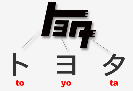
Katakana – ト ヨ ダ
Hiragana – と よ だ
Romaji – to yo da
 The second logo won’t win any design contests either. Actually, it did win a design contest. In 1936, three years after Toyoda established an automobile department, Toyoda held an open contest to design their new logo. Out of 27,000 entries this is the one that was chosen.
Before all you import car guys get crazy and call it the “teq” logo, which I have seen in numerous Toyota enthusiast forums, you should be aware that this is not hard-to-read English. It is in fact, very calculated Japanese. I have taken the liberty of creating the imaginary logo that you are seeing in your head. WARNING: The logo on the left only exist in your head.

Your eyes want to see the logo on the left! But it does not exist. You even want to give it a back story like; “teq” is short for “technology”, which is the Toyota research and development department before it was changed to “TRD” (Toyota Racing Development).
Don’t let the Katakana intimidate you! Don’t start reading in English. Pull yourself together! If you read Part 1 of Toyota and Katakana you will start to recognize this logo for what it is: Three Japanese Katakana letters, (to, yo, and ta) forming the word “Toyota”
This new logo was more than just a visual graphic change. The name switched from roman letters to Japanese Katakana. When read in Japanese the last letter reads as “ta” not “da”. There are two little lines that turn the voiced “da” sound into an unvoiced “ta” sound (below). It was decided to remove the 2 marks in the logo, and therefore change it to Toyo”ta”.

I have read many reasons for the graphic switch from Toyo-da to Toyo-ta:
- It sounds more appealing.
- It looks cleaner.
- It transitions a family business to a international company.
- The “Ta” Kanji means rice field, and they want to distance themselves from old farming.
Some of these reasons may be more valid than others. I am mostly trusting the information closest to Toyota, and not some of the various design websites.
The most valid one, and the one I will focus on here, is the changing from 10 lines to 8.
The lines being referred to are the lines used to write the letters in any Japanese character. They are called “strokes”. They are written in an exact way, with a specific order. (I will go in to more detail on lines, and stroke order using a different car company) For now I will show you the “stroke order” as it’s called, for the Katakana word Toyota. (below)

When written correctly, the word Toyota is done with 8 strokes of the pen. However, if you write the word toyo”da” it adds two more strokes (highlighted in the red circle below). This would bring the total to 10 strokes. The actual winning entry had used the word Toyo”da”, which would have looked something like the black logo below.

These two little lines may not seem like a big deal, but they are. They are a very big deal. The stroke number in Japanese culture is important in several ways. In this particular case it is a matter of reaching the number “8” which is a good number to the Japanese.
She is trying to tell you what I am trying to tell you. The only difference is that she is wearing white gloves. (photo courtesy Bertel Schmitt, Wikipedia)
I have read in many English publications that say that Toyota changed it because “8” is “good luck” in Japanese. This may be the case, but it’s not quite as simple as that generalized translation. Seisi Kato, who was then in charge of Toyota’s advertising and promotion, says it a little more accurately,
“The Japanese character for eight suggested further growth.”
When the number “8” is written in Kanji, it takes on a distinct shape. I have assembled the brush style kanji and the printed style kanji to show its over-all shape. The key feature being the outward swooping lines.
 In Japanese culture, theses swooping lines represent the start of a curving line that can continue to move out. A visual reference of continued growth and prosperity. That sounds like good words for Business!
This Kanji character for the number eight is called “hachi”. The kanji symbol itself has nothing to do with the Toyota company logo. I only point it out to reference its origins as a favorable number in Japanese culture.
However, there is another lesser know fact about the hatchi Kanji and Toyota. Sakichi Toyoda’s son, Kiichiro, was head of the automotive department at the time. He was born in Nagoya, Japan in 1884. The original loom factory is now a museum just down the block from Nagoya Station. The City of Nagoya and its surrounding area, is where Toyota started and where it still is.
Maruhachi flag flying over Nagoya City Hall, Japan
The symbol of the City of Nagoya is the “maru-hachi” (literally “circle eight”). It is the hachi kanji with a circle around it. The symbol adorns everything form the city flag, to their sewer manhole covers. It is featured prominently on the city’s website and even on their twitter page.
Kiichiro thought that it was a fitting reference to Toyota’s home town. It’s yet another reason to keep the Toyota logo’s stroke number at eight.
Wow… who knew that 2 small lines could make such a difference? Tune in for Part-3 of the Toyota Katakana series, where we talk about the current Toyota logo and what interesting things it has to say about Japan and its culture.
